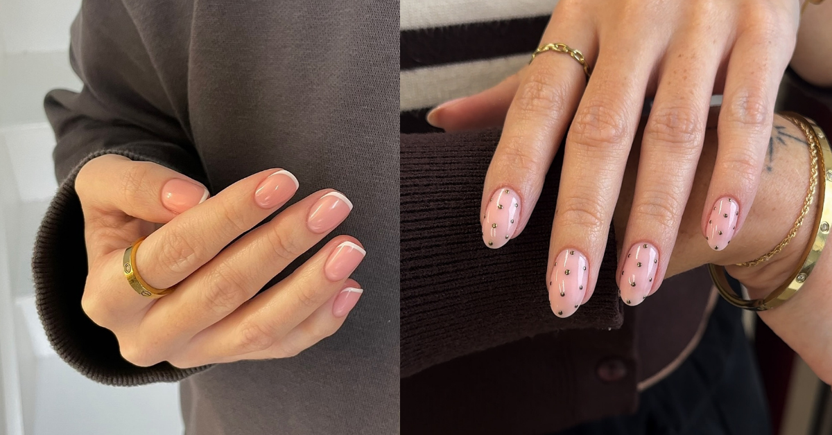
A nail design can be trendy and still look cheap for one simple reason: the “expensive” part of nails is rarely the idea. It’s the execution.
Think of it like a white T-shirt. The concept is basic. The difference between crisp and sloppy is fit, fabric, and finishing. Nails work the same way. A chrome glaze, aura fade, micro French, or 3D bow can look editorial… or like plastic press-ons from a distance. The line between those two is usually thickness, shape, cuticle work, and restraint.
Also, a slightly uncomfortable truth: a lot of nail trends are optimized for close-up camera shots. They look amazing on a ring-light Instagram reel, then the same design in real daylight can feel busy or a bit “crafty.” That doesn’t mean you can’t wear them. It just means you need a few guardrails.
Below are the most common reasons trendy nails read cheap, plus the fixes that make almost any style look more polished.
Quick takeaways
- “Cheap-looking” nails are usually too thick, flooded at the cuticle, or poorly shaped, not inherently “bad taste.”
- The fastest upgrade is leaving a tiny margin near the cuticle and sidewalls and keeping layers controlled.
- Trendy finishes that read most “expensive” right now tend to be sheer, pearly, and soft (baby chrome, micro French, soap/jelly nails).
- 3D details are the easiest to make look cheap because they add bulk and snag. If you love them, do one accent nail and keep everything else simple.
- If your polish lifts or peels fast, it can make even perfect nail art look “off.” Prep matters, especially around the cuticle area.
If you only do one thing: choose a good shape + clean cuticle area + one trend element (finish OR art OR charm). Not all three.
The decision framework: why nails read “expensive” or “cheap”
When nails look expensive, they usually have:
- Clean boundaries (not touching skin, not messy around edges)
- A consistent shape across all nails
- Even thickness with a smooth light reflection
- A design scale that matches the nail length
- Wear that looks intentional (not chipped, lifted, dulled)
When nails look cheap, one of those five is breaking.
The biggest reasons trendy nails look cheap
1) They’re too thick (the “bubble nail” problem)
This is the number one giveaway, especially with gel, builder gel, Gel-X, or layered chrome looks. Thickness makes nails look like plastic, and it also makes the surface reflection uneven, which reads instantly less polished.
What causes it:
- too much product on the brush
- trying to fix streaks by adding more layers
- piling top coat on top of art and charms
Fix:
- ask for “thin, even coats” and a smooth apex (if you’re doing extensions)
- if you DIY, aim for two thin coats rather than one thick one
Trade-off with no perfect solution: ultra-thin gel looks more natural, but it can be less forgiving on very uneven nails (ridges, dips). You may have to choose between “glass-smooth” and “super-natural thin.”
2) Product is too close to the cuticle (or flooded onto skin)
When gel or polish touches the cuticle/sidewalls, it can lift faster and it makes the manicure look messy even if the color is perfect. Many pro guides call out cuticle-area prep and avoiding flooding as key to preventing lifting.
Fix:
- leave a tiny hairline gap near the cuticle so it looks clean as it grows out
- if you want your nails to look longer, the “Italian manicure” trick is literally built around leaving subtle negative space at the sides for a cleaner illusion
If you’ve ever looked at your nails and thought “why do they look chunky and short,” this is often why.
3) The shape is slightly off (and your eye notices)
You don’t need extreme almond or perfect squares, but you do need consistency. One nail flaring wider, one with a crooked tip, one that’s shorter than the rest can make even expensive nail art look DIY.
Soft oval shapes and more natural silhouettes have been called out as a continuing trend direction, partly because they look cleaner and more wearable.
Fix:
- pick one shape and commit: soft oval, short squoval, almond
- match nail length to your lifestyle (shorter looks cleaner longer)
This won’t work if your nails break unevenly and you refuse to shorten the set to match. Mismatched lengths are hard to “design your way out of.”
4) The design is the wrong scale for your nail length
A tiny nail with a huge charm, thick French tips, and dense art looks crowded fast. A long nail with micro art can look sparse and accidental.
Fix:
- short nails: micro French, baby chrome, sheer “soap” finishes, minimal decals
- medium nails: aura fades, delicate florals, mixed metals
- long nails: bolder art can work, but keep the palette tight
5) Too many trend elements at once
This is where “Pinterest cute” becomes “toy-like.”
Common overload combos:
- chrome + aura + gems
- French tips + 3D bows + heavy glitter
- multiple accent nails with totally different motifs
Fix:
- choose one hero trend:
- finish (chrome, velvet, pearly)
- art (aura, micro French, florals)
- texture (3D, gems, charms)
- everything else should be quiet
I usually tell people this: if you want nails to look expensive, stop chasing variety on all ten fingers. One good idea, executed cleanly, beats five ideas competing.
6) The finish looks dull, scratched, or uneven by day 3
Even a gorgeous set can start reading cheap when the top coat loses its shine, edges chip, or lifting starts. A lot of “cheap” is simply “worn.”
Pro manicurists often point out habits that make polish peel sooner, including soaking nails in water before a manicure (nails can absorb water and later contribute to peeling as they dry).
Fix:
- use gloves for cleaning
- cap the free edge (especially for regular polish)
- keep cuticle oil as part of the aftercare routine so the set stays fresh-looking
Trendy designs that can look cheap (and how to make them look chic)
Chrome and glazed nails
Chrome looks expensive when it’s subtle and even. It looks cheap when it’s streaky, too metallic, or paired with bulky shape.
A softer “baby chrome” look is literally described as a more understated alternative to traditional chrome.
Make it look luxe:
- choose milky, sheer, or neutral bases
- keep nails thinner and smoother than you think
- avoid adding heavy gems on top of full chrome
Optional: skip chrome powder entirely and do a pearly top coat if you’re DIY and struggle with even application. If it stresses you out, it’s not worth it.
Aura nails
Aura nails are basically a centered glow effect. They look cheap when the fade is harsh or the colors fight your skin tone.
Make it look luxe:
- choose two colors that are close in tone (soft contrast)
- keep the rest of the nail clean, no extra glitter unless it’s extremely fine
Micro French
Micro French looks expensive because it’s minimal and the line work is clean. It looks cheap when the smile line is thick, uneven, or too white against a stark base.
Micro French tips are literally being flagged as a continuing trend for 2026.
Make it look luxe:
- ask for “micro” or “baby” French, not classic thick tips
- use off-white, cream, or soft metallic instead of bright white if you want it softer
3D charms and coquette bows
3D is fun. It is also the fastest route to “looks cheap,” mainly because bulk and snagging make sets look worn quickly. Even trend roundups note these looks require more skill and intricacy.
Make it look luxe:
- do one accent nail per hand
- keep the base sheer and clean (milky nude, soap nails, baby chrome)
- choose smaller charms and place them lower on the nail so they don’t look like toys
Trade-off without a solution: 3D nails snag. If you type a lot, wear contacts, or have sensory issues, you might hate them no matter how cute they look.
The “expensive manicure” checklist (bring this to your next appointment)
Ask for:
- clean cuticle work and no product touching skin (tiny margin is good)
- a consistent shape across all nails (soft oval, squoval, almond)
- thin, even layers and smooth reflection
- one main trend element (finish OR art OR texture)
And if you want nails that grow out gracefully:
- choose designs that still look intentional with a week of growth (sheer finishes, micro French, soft chrome)
FAQ
Is it “cheap” to like bold nail art?
No. Bold can look incredibly expensive. The difference is usually precision, thickness, and cohesion. Big art needs cleaner finishing, not less personality.
What nail trends look the most expensive right now?
Sheer, glossy, “clean” nails and subtle pearly finishes are being highlighted across 2026 trend coverage, along with micro French and soft shapes.
Why do my nails look good in photos but cheap in real life?
Phone cameras flatten texture and hide small thickness issues. Real life lighting shows the surface reflection, cuticle mess, and uneven shape more clearly.
Why do my gel nails lift at the cuticle?
Common causes include cuticle tissue left on the nail plate and product applied too close or flooded at the cuticle. Pro prep guides emphasize removing non-living tissue and keeping product off skin.
What’s the easiest “fix” if my nails always look a little off?
Choose a simpler design (sheer base + micro detail), prioritize shape, and insist on clean cuticle boundaries. When in doubt, “less but cleaner” wins.
Just a little note - some of the links on here may be affiliate links, which means I might earn a small commission if you decide to shop through them (at no extra cost to you!). I only post content which I'm truly enthusiastic about and would suggest to others.
And as you know, I seriously love seeing your takes on the looks and ideas on here - that means the world to me! If you recreate something, please share it here in the comments or feel free to send me a pic. I'm always excited to meet y'all! ✨🤍
Xoxo Charlotte


